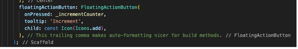
We’re all familiar with the default Flutter Counter app. Yet, have you ever taken a moment to ponder the origin of that captivating, iconic blue color of the ‘FloatingActionButton’?
Surprisingly, it’s a mystery hidden within the code, with no explicit color property to be found.
Moreover, have you ever wondered how to seamlessly integrate a refined color scheme into your own Flutter app?
If you’re a Flutter enthusiast eager to master the art of app design, you’re about to embark on an enlightening journey.
Today, we’re delving into the heart of Flutter’s design framework, exploring the finesse of ‘ThemeData’, the role of the indispensable ‘ColorScheme’, and how these components collaborate to craft visually captivating user experiences.
Setting the Stage: The ‘ThemeData’ Class
In the world of Flutter app design, ‘ThemeData’ is your guiding light, illuminating your path to crafting a captivating user experience. Beyond the aesthetics, it defines the very essence of your app’s visual identity.
Colors and Typography: Brushstrokes of Elegance
Colors form the heartbeat of your design. With ‘ThemeData’, you define your app’s color palette using the ‘ColorScheme’ class, ensuring a harmonious, inviting appearance. Typography, the silent narrator, plays an equally vital role as you create text styles for various components, weaving a narrative of elegance and coherence.
Themes in Flux: A Dance of Light and Dark
Flutter’s beauty lies in its adaptability. ‘ThemeData’ transcends static design; it’s dynamic and versatile. The ‘brightness’ property empowers you to effortlessly switch between light and dark themes, catering to diverse user preferences and varying lighting conditions.
BM Insight: In the dynamic world of mobile app development, it’s vital to recognize that apps are utilized across an extensive array of devices, each with its unique configurations. This underscores the pivotal role of comprehensive and frequent testing. For further insights into mastering mobile development and ensuring your app’s compatibility, you can explore our 7 Essential Tips for Mastering Mobile Development.
The Backbone of Design: ‘ColorScheme’
Meet the unsung hero—the ‘ColorScheme’ class. It forms the bedrock of your ‘ThemeData’, encapsulating primary, secondary, background, surface, and error colors. This foundational gem ensures a harmonious, visually united experience across your app.
ColorScheme myColorScheme = ColorScheme.light(
primary: Color(0xFF6200EA), secondary: Color(0xFF03DAC6), background: Color(0xFFFFFFFF), surface: Color(0xFFFFFFFF), onPrimary: Color(0xFFFFFFFF), onSecondary: Color(0xFF000000),
// ...other color variants );
Striking the Perfect Balance
For a streamlined design approach that doesn’t require granular control over every aspect, using ‘ColorScheme’ within ‘ThemeData’ is an excellent choice. It provides you with a set of 10 essential colors, such as primary, secondary, background, and more, while also allowing you to add additional colors if needed.
This strikes a balance between consistency, ease of use, and the flexibility to cater to your app’s specific design requirements.
Light and Dark Themes in Action
Themes empower your app to adapt seamlessly to different environments. Here’s a snippet demonstrating how to set both light and dark themes:
final lightTheme = ThemeData( brightness: Brightness.light, primaryColor: Colors.blue,
// ...other properties
);
final darkTheme = ThemeData( brightness: Brightness.dark, primaryColor: Colors.deepPurple,
// ...other properties
);
void main() { runApp( MaterialApp( theme: lightTheme, darkTheme: darkTheme, home: MyApp(),
),
); }
Pro Tips for Developers: Effortless Adaptation to Theme Changes in Your App
When designing custom widgets with unique color schemes, consider utilizing a ‘ThemeData’ extension. By creating getter methods within this extension, you can easily access theme-dependent colors.
Here’s a concise example:
extension ThemeDataExt on ThemeData { bool get isDarkMode => brightness == Brightness.dark;
Color get warrningDialogBackground => isDarkMode ? Colors.black : Colors.white; }
Consider these two approaches when designing a ‘WarningDialog’ widget:
1. Using Hardcoded Colors:
WarningDialog( color: Colors.white, // Other properties...
)
While this approach works, it may pose issues if you later decide to implement dark mode. You would need to update the color manually.
2. Using ‘ThemeData’ extension Colors:
WarningDialog(
color: warningDialogBackground,
// Other properties...
)
The second approach is more flexible and maintainable, making it a better choice for long-term development. This approach enhances code organization and readability, making it more straightforward to incorporate theme-based colors into your Flutter widgets.
By utilizing a theme-dependent color, like ‘warningDialogBackground’, you future-proof your widget for dark mode implementation. It seamlessly adapts to theme changes without requiring manual adjustments.
Empowering User Experiences with Themes
In the mesmerizing world of Flutter design, ‘ThemeData’, and the invaluable ‘ColorScheme’ come together to craft an experience that’s both visually captivating and consistently coherent. Themes not only establish a harmonious color palette but also adapt to the user’s environment, providing both light and dark options.
As you journey through Flutter’s design framework, remember that you’re the conductor of your app’s visual symphony. Whether replicating the allure of the default counter app or forging an innovative path, Flutter’s design elements are your tools, and you’re the artist.
Let’s create experiences that captivate, inspire, and delight.
Happy designing!
About author:
Marko Krstanovic is a talented software engineer and technical officer with a proven track record of delivering exceptional mobile applications. His expertise spans various programming languages and technologies, including iOS and Flutter, which he has used to create seamless and secure client apps. With over five years of experience, Marko is a true innovator in the tech industry, constantly pushing the boundaries of what’s possible in mobile app development.